The Innovators Have Spoken: Here are the Winning Entries in the 2018 Imaging Innovation Awards
Last spring RBJ put out a call for entrants to compete in its inaugural Imaging Innovation Awards. We opened the contest to all private radiology practices and hospital radiology departments that had recently completed a project combining creative thinking with coordinated teamwork to develop a notably original breakthrough in some particular aspect of medical imaging.
By the end of the entry period in the summer, we had received some 17 completed submissions. From these, our five judges—all daily radiology observers with zero vested interest in “IIA” outcomes—narrowed the field to nine finalists.
Next the panel weighted these worthy entries for footprint of entrant and degree of difficulty. This was only fair, as some smaller players with limited resources went up against some of the biggest and best-heeled kids on the block.
Finally, the judges voted, unaware of one another’s choices. Here are the winning entries, presented in alphabetical order.
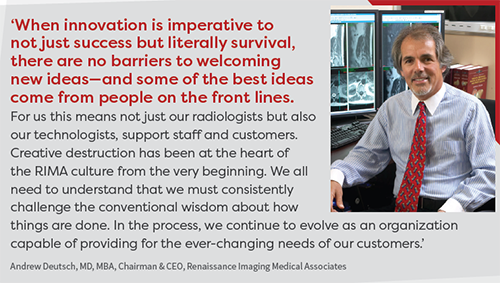
KICKING QUALITY & SAFETY REPORTING UP A NOTCH
By Advanced Radiology
One of the most critical components of high-quality care is safety. Open and candid communication among our team is the key to continuously improving the safety of the care we provide and the environment in which we work. As part of a company-wide initiative to ensure patient safety, quality of care and regulatory compliance, Advanced Radiology wanted to create an easy-to-use but robust reporting program. The program would need to a.) allow event reporting through the most popular channels, b.) be thoroughly intuitive so as to require little or no user training, and c.) allow for reporting of all necessary information for documentation and analysis of quality and safety events. Most important, it was essential that all staff saw this project as an effort to further increase patient safety and overall quality—not as a policing and punishment initiative.
Aims and objectives: Our primary goal was to improve communication of quality issues through an easy and simple process, allowing our radiologists to provide feedback to management that would help improve clinical performance and quality. We felt strongly that this would be the first step in creating a just culture in which fear of retribution or punishment did not diminish our ability to continually improve.
Leadership and project management: Our CMIO, Gerard Muro, MD, built the initial online platform and championed its further development. The project was then handed off to our director of quality, safety and compliance to enhance and grow. In collaboration with our internal IT team and an external developer, the team created a suite of reporting channels over the course of two months. The suite included a dedicated email address, phone hotline, paper form and iCare, our online safety event reporting application. Development involved creating a compendium of quality and safety concerns, establishing impact levels, and establishing a set of event identifiers such as date, time, attending radiologist and patient ID where necessary. After thorough testing, a program introduction was made and usage instructions were distributed throughout the company.
Key steps: Estimated ideal reporting levels were calculated as a percentage of annual exam totals. An initial adoption period was estimated in which the company would reach those expected reporting levels. It was projected that the number of events reported through the program would rise until reaching the expected level, then slowly decrease as safety and quality measures became embedded in the company culture.
Positive outcomes: The number of reports increased as projected over the initial five months and continues to rise as it approaches projected percentages of total exams. The online application also allows for export of data for reporting, tracking and analysis, which helps us identify and implement procedural improvements.
Innovative elements: From ideation to construction to adoption, this project leveraged the talents of our compliance, IT and marketing teams to define the challenge, develop a comprehensive solution and successfully promote its use. Central to the success of our project was a focus on two principles: 1. Though our primary goal was to improve communication around quality issues, we knew this effort could be leveraged to realize the larger goal of creating a just culture in which each individual shared responsibility for the overall quality, safety and compliance of the practice’s operations. Recognizing the inherent fear of self-reporting and creating a system in which there was no punishment mechanism allowed us to build and grow our user base. 2. By understanding that different people prefer different methods of communication and incorporating those methods into our system, we maximized the ease of use for each individual. This accommodated staff member of all age groups and technical abilities.
Submitted by Bob Evangelista, marketing manager. Advanced Radiology is based in Shelton, Conn.
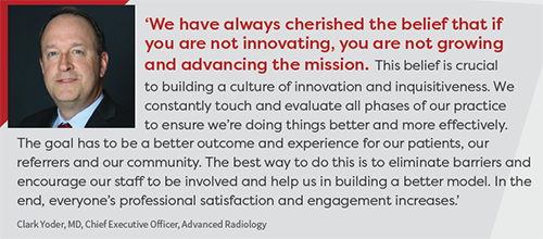
INFORMING PATIENTS ON BREAST DENSITY AND WHY IT MATTERS
By Lake Medical Imaging
With multiple breast imaging modalities for 2D and 3D mammography, breast MRI, automated breast ultrasound (ABUS) and contrast-enhanced spectral mammography (CESM), we recognized a need to make recommendations for additional imaging that would be evidence-based, consistent and streamlined for both women and their referring doctors.
Aims and objectives: Increase the breast cancer detection rate for women with dense breasts, educate women and the referring physician community about the implications of dense breast tissue and what to do about it.
Leadership and project management: Guiding vision consisted of five components: 1. Algorithm of imaging based on density and published data created for the breast imagers. 2. Breast density info sheet for patients, techs and referring docs. 3. Process for informing and educating patients of their breast density, implemented with same-day notification at time of screening mammography. 4. Consistent means of notification for referring docs of what added imaging might be needed and how to schedule it. 5. Outreach lectures to women’s groups and referring doc groups.
Key steps: 1. Review literature and discuss resources with managers. 2. Create and review drafts of info sheet; design with graphic artist and send for printing. 3. Train mammo and ultrasound techs, aides and schedulers in new process. 4. Create a calm, patient-friendly environment in breast imaging waiting area. 5. Procure, install, train and implement digital breast tomosynthesis (DBT), ABUS, CESM. 6. Create lectures and present to women’s groups and referring doc groups.
Positive outcomes: Increased patient satisfaction with the entire breast cancer screening experience. Increased referring doc satisfaction. Increased patient and referring doc loyalty. Improved collaboration with national organizations. Improved breast cancer detection rate.
Innovative elements: Revised the manner of communicating results of mammo to include breast density in the lay letter and changed how information was presented to the referring docs. Revised the mammo reports. Marketed availability to meet with referring docs and teach about breast density and the newer imaging modalities.
Submitted by Cathrine Keller, MD, president and managing physician. Lake Medical Imaging is based in Leesburg, Fla.
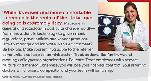
GETTING AN EHR TO ‘TALK BACK TO’ DOCTORS— LITERALLY
By the Division of Interventional Radiology at Massachusetts General Hospital
In October 2014 we participated in a hackathon, the challenge of which was to develop an application for a mobile/wearable device that would be useful in healthcare. During brainstorming, we came up with the idea to create an application that could verbalize the electronic health record (EHR). Over the course of two days we developed a prototype we named CADI, for Clinical Assist Decision Interface. The prototype allowed clinicians to verbally ask questions of the EHR and receive verbal responses. (Think Alexa in the hospital.) It would be the first time in the 200-plus year history of MGH that the hospital talked back to its doctors.
We subsequently focused and further developed the application and concentrated on using it to verbalize the universal protocol for a hard-stop timeout prior to all medical procedures. We then fine-tuned CADI for interventional radiology timeouts. CADI automatically retrieves patient procedure, site, side, patient demographics, relevant up-to-date lab values, allergies, medications and specimen orders for a specific patient from the EHR and verbalizes the information during a hard-stop timeout. After developing the software, we conducted a study of its performance and user acceptance compared to standard timeout processes.
Aims and objectives: The main aim of our project was to see whether a software application that can verbalize the EHR was more accurate and increased compliance for timeout compared to standard paper-based timeout process. At the time, standard timeout processes in interventional radiology (IR) involved a trainee or staff member looking up information and verbalizing it from memory at the point of care. We also hoped to achieve improved acceptance and use of the EHR.
Leadership and project management: CADI was the first project of out MGH’s ITQS lab (Informatics & Technology for Quality & Safety) and supported by the department of radiology. After CADI was developed for use in IR, we proceeded with a study that collected observational and user survey data.
Key steps: 1. Software design and development to improve timeout workflow. 2. Obtaining approval by hospital IT and QA departments, and hospital leadership. 3. Needs assessment by conducting a preliminary user surveys of all staff in interventional radiology. 4. Preliminary observation of current standard paper-based timeout processes. 5. Beta deployment of CADI software to a small group of individuals to receive feedback about functionality and user interface. 6. Widespread deployment to all of IR. 7. Collection of real-time observations in the use of CADI during timeouts. 8. Post-deployment user survey assessing user acceptability.
Positive outcomes: Compared with paper-based timeout, CADI statistically improved individual checklist variables including site confirmation, verbalization of laboratory values, anticoagulant status, allergies and specimen to be sent. Survey results showed that CADI was perceived to be more efficient in preparing information for a timeout because CADI delivered information instantaneously compared with the perceived five-minute prep required for a paper timeout. CADI timeouts also were perceived to be more accurate for all information delivered. There’s more, and the full results of the project are available in the October 2017 issue of JACR. (Reference: Uppot et al., “A Verbal Electronic Checklist for Timeouts Linked to the Electronic Health Record.”)
Innovative elements: CADI addresses widespread frustration with the EHR by verbalizing information to bring real-time clinical insights to the point of care. Given our success in IR, our next step is a two-year study designing, deploying and testing CADI for timeouts in MGH’s ICU. We also are developing a CADI module for clinical rounds preparation to deliver a clinical summary and 24-hour update of patient from notes, updated images and updated labs, as well as a module to help diagnostic radiologists by verbalizing a short clinical summary of each patient prior to image interpretation.
Submitted by Raul Uppot, MD, interventional radiologist at MGH and assistant professor at Harvard Medical School.
GOING BEYOND MERE ONLINE ENGAGEMENT TO FULL PATIENT INVOLVEMENT
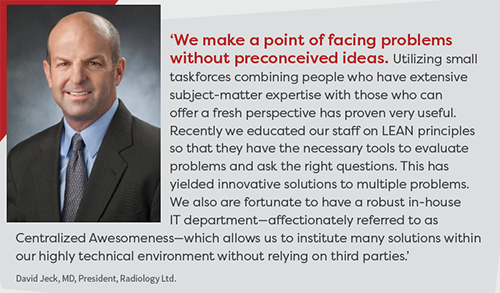
By Radiology Ltd.
Online information regarding screenings guidelines, particularly for mammography, varies widely depending on the website or organization. These differences in opinion have caused a lot of confusion for patients looking for a standard guideline they can trust for preventative health screenings. The ScreeningsForLife.com website project is our solution to a complex problem surrounding best practices for patient care.
Aims and objectives: Screeningsforlife.com is designed to take the guesswork out of preventative health screening questions. At what age should I first get screened? How often do I need to get screened? Am I at high risk? All these questions can be answered by completing the assessment test we provide on Screeningsforlife.com. Beyond our main objective, we hope patients take action if a screening is needed. They can request an appointment online or print out the results and call us directly to schedule an exam.
Leadership and project management: The project was led by our internal marketing team with help from a local website design company. We needed a website that was engaging but also resourceful. Once the questionnaire was written, we enlisted the help of our radiologists to provide the clinical guidelines needed to create the appropriate algorithm. We currently promote the website via social media, Google display ads, Facebook ads and directly from our main practice website, RadLtd.com.
Key steps: 1. Establish patient pain points: We noticed a local and national trend of patient questions related to screening guidelines. Using Google keyword planner tool, we researched how many times screening-related questions were searched on a local and national level and tracked specific interests. 2. Develop a solution: Now more than ever, patients are looking for transparency and simplicity in their healthcare, and this was an opportunity for us to create a competitive advantage. What if we could build a tool with a custom algorithm built in that suggested which screenings are recommended for them based on an assessment test? Once committed to that idea we started the buildout process with a local website development company. 3. Basic to basics: We wanted to create a user experience that made the patient feel unique and special but without going overboard. And we wanted a homepage that encouraged action over browsing. Time on site and pages visited were secondary to bounce rate and conversions. 4. Teamwork makes the dream work: We worked with our radiologists to develop a questionnaire that was both clinically accurate and patient-friendly. The hardest part during this process was getting the docs to buy in on the concept that less is more. Everything on the site is designed to give only the information the patient needs. 5. Implementation: Merging the assessment test with the design was the final piece of the puzzle. We opted to break the questions up based on category (“My Health,” “Family History,” “Previous Screenings”) and created a multi-stage approach to give the visitor a sense of progress as they filled out each page. The results page was designed to give those that completed the test the chance to schedule (certain) exams online, email their results or call for an exam.
Positive outcomes: Among the many nuances that reflected a positive impact for us, the first is how well the project complements our main website. Google Analytics shows that our website visitors aren’t interested in reading about exams, so this provided us with a new engagement tool that solidifies our reputation as thought leaders and allows us those few extra minutes to make an impression with a new or returning patient. It’s been a big boost to our social media and digital marketing campaigns to have a one-of-a-kind engagement tool. Creating brand separation with our competitors via Facebook or Google has traditionally been a bit basic. This website allows us to create digital campaigns that we haven’t been able to run in the past, and it works well out in the field. With a tablet or laptop positioned at a table, our reps use the site as a valuable icebreaker and conversation piece to educate patients and providers about our services.
Innovative elements: We approached this project with an open mind and rallied behind a leadership team that values digital analytics and isn’t afraid to think outside the box. This gave the project team freedom to pursue innovative ways to adapt complex and often confusing preventative health screening information into a simple formula while still maintaining its integrity. Using an algorithm to produce custom results for each user was the key to making a site that fulfilled our project goals and helps us continue as a company to provide the best possible patient care.
Submitted by Kyle Baril, marketing specialist. Radiology Ltd. is based in Tucson, Ariz.
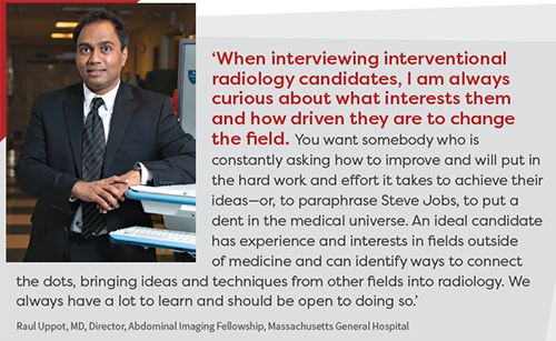
 IMPROVING IMAGE QUALITY ONE COMMUNICATIVE CLICK AT A TIME
By Renaissance Imaging Medical Associates
We are a geographically diverse organization with multiple locations that are separate and distinct. We wanted to develop a means to provide quality improvement for all images at all sites. The main challenges were as follows: How do we provide feedback and quality control on every single one of the 1 million-plus studies we read each year, without overwhelming the doctors or the system? With so many different technologists working so many shifts, how do we provide fast and accurate feedback to each? How do we promote and provide a feedback loop that is tangible, can be followed and quantified, and is useful for radiologists, techs, supervisors, managers and hospital administrators?
Aims and objectives: The main aim was to develop a novel system for direct collaborative communication feedback to our various imaging sites for the express purpose of improving image quality at all our hospitals, imaging centers and contracted facilities—and to do so in a time efficient easy manner that would promote radiologist adoption rather than rejection due to time constraints.
Leadership and project management: The idea was born simply by staring at cases on the PACS all day long, wishing for a better way to improve image quality and realizing there was no commercial solution that truly fit our needs. The project was led by Mark Beller, MD, chief medical officer, and it became the genius work of our CIO and IT team. They built the system from scratch and made it a reality. We would meet every few weeks over the course of several months to discuss the status and ongoing development of project particulars. Probably most importantly, we constantly discussed what goals and what purpose this program/process must help us achieve for our organization. Promotion and project implementation, mainly via mass emails to all stakeholders, were incorporated into the development process.
Key steps: After our CIO and IT team built the system, we tested it with a small handful of radiologists and asked for feedback. This helped us iron out wrinkles, fix bugs and make the system workflow-efficient. Next we worked with several of the site managers who were receiving these test sample cases to get their feedback and to see what additional information they needed. This was crucial, as it helped us understand we needed to keep a permanent log and provide a means of sending and receiving feedback. For the go-live, we sent a group email to the radiologists and site manager/supervisors announcing the new system’s full availability.
Positive outcomes: The effect was immediate and intense. Our radiologists were happy to finally have a way to provide our techs feedback on any given image at any given time, without having to really slow down their reading speed. This improved morale, as all felt this was truly a unique and potent process to improve quality and decrease exam submission errors. Most surprising and most pleasing was the positive feedback received from site supervisors and managers. They really had no idea of the depth of the issues and problems that had been plaguing the radiologists on a daily basis. In the months since the go-live, we have seen a significant drop in the number of submissions at almost all sites, indicating a significant improvement in image quality, improvement in exam “completeness,” and a significant drop in tech errors.
Innovative elements: We placed a “hot button” directly into our PACS that is available to click on every case. When clicked, a popup dialogue appears instantaneously right on our screen. In the pop-up dialogue screen, there is an easy dropdown menu that provides stock responses to the most common problems we face with our cases, along with a notes section for free text if needed. This time-saving design is crucial. Once the submit button is depressed, the QA submission is delivered via email to specific recipients pre-determined by the sender. We have it set up so that, for any given site, the submission is simultaneously auto-emailed to the site manager as well as the medical director. Importantly, only the accession number is included in the email, ensuring HIPAA compliance. All emails are logged in a system that tracks all issues per site for further evaluation over time.
Submitted by Mark Beller, MD, chief medical officer. Renaissance Imaging Medical Associates is based in Los Angeles.
